To demonstrate how
Publisher 2010 works I’ve decided to take a piece of text of three short paragraphs in length, use a landscape page layout with three columns. Half of the last column will be used for an image and the top of the first two columns will contain a title. The problem to be resolved is to fit the text perfectly into the remaining space.
The text I will use it taken from the Microsoft Security Essentials home page. There are several reasons for returning to the page (it’s the same page used in PowerPoint IV). Firstly, the program, when it is released, will be free so there is no issue with advertising it. Secondly, the page has lived its short life, it appeared on June 23 to launch the limited (I think it was 75,000 downloads) beta version which in turn was limited to 3 specific countries. And lastly, I have the page bookmarked for later reference.
Open Publisher, the program opens on the New Tab from the Office Button. I will use a landscape format but, for now, I will open the Blank A4 (Portrait). Go to the Page Design Tab > Page Setup > Orientation and select Landscape.
Still on the Page Setup Group, click Margins, at the bottom of the list select Custom Margins.
On the Layout Guides select the Grid Guides Tab > Column Guides > Columns and increase the number to 3, leave the Spacing at 0.5cm, Rows at 1 click and close.
We now have thin blue lines (Guides) separating the columns. Select Insert > Text > Draw Text Box. Drawing objects, in this case a text box, between the guides is quick and easy. Place the cursor anywhere near the blue line and the box will snap to the guides. Insert three boxes using the full size of the columns.
Reduce the height of the first two boxes by about 1.5cm using the side ruler has a guide. Shorten the size of the third column by half, leaving a space at the bottom. We now need to connect the boxes so the text will flow from one to the other.
With box one (left) selected, from the Text Box Tools > Format Tab > Linking, click Create Link, click on the Text Box you want to link to (middle). A pointer will appear on the left of the middle box pointing to the box it is linked to, and vice versa. Click on the middle box, to select it and repeat the process linking it to the box to its right. The reason for linking the boxes is that when we paste the text into box one the overflow will appear in boxes two and three.
I will now go back to the
Microsoft website, copy the three paragraphs and paste them into text box one. The text has filled column one and part of column two.
Unfortunately, Publisher has used hyphenation (added hyphens "-", on the ends of lines). With the text highlighted go to Text Box Tools > Format > Text > Hyphenation, in the dialogue box deselect 'Automatically hyphenate this story'.
Returning to box one, highlight the heading ‘Collection and use of your personal information’. Change the size and type of font in the Home Tab to Times New Roman, 26pt bold, highlight the rest of the text and change its size to 12pt and justify the text (excluding the heading).
The intention is to fill the third box fully without adding anymore txt. Highlight the ‘W’ from ‘When’, the first letter of the first sentence, Text Box Tools > Format > Typography > Drop Cap. Click Drop Cap > Custom Drop Cap > Dropped > Size of letters: 4. Repeat the process for the first letter of the other two paragraphs changing the Size of letters: 2. Change the font of the three letters, W, E & M to Times New Roman and their colour to Accent 3 from the Scheme colours Home > Font > Font Colour.
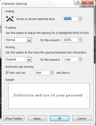
With all three paragraphs highlighted, including the heading, go to the Home Tab > Font > Character Spacing > More Spacing. From the dialogue box Character Spacing > Kerning > Use this option to fine-tune the spacing between two characters. Expand: By this amount: 1.6pt (sometimes you have to play around with it until you get the right size). The text will now have filled the third column.

From the Insert Tab add an image, Insert > Illustrations > Picture, drag the image to the space in the bottom right, resizing if necessary. Insert a text box for the title, Insert > Draw Text Box and type in the title. With the title highlighted set the font size to 36pt. In Drawing Tools > Format > Shape Styles choose an appropriate style, in this case Linear Up Gradient - Accent 1.

See how it looks


0 comments:
Post a Comment